Choosing the right kitchen cabinet color can change how your whole room feels. The best shades work with your light, your countertops, and your floor, not just the trend of the moment.
In this guide, you will find kitchen cabinet color ideas based on real, modern looks like deep navy blue, soft dove gray, forest green, and warm beige. Each section includes quick styling ideas, plus a pro design tip and a budget note to help you plan.
If you are coming from Pinterest, you can use this post like a checklist. Match a cabinet color to your countertop (white quartz or marble), your hardware (brass or brushed metal), and your flooring (light oak or polished hardwood) so the space looks balanced.
Pick one look that fits your home style, then use the small changes suggested to make it feel finished, even if you are not doing a full remodel.
1. Deep Navy Blue Kitchen Cabinets

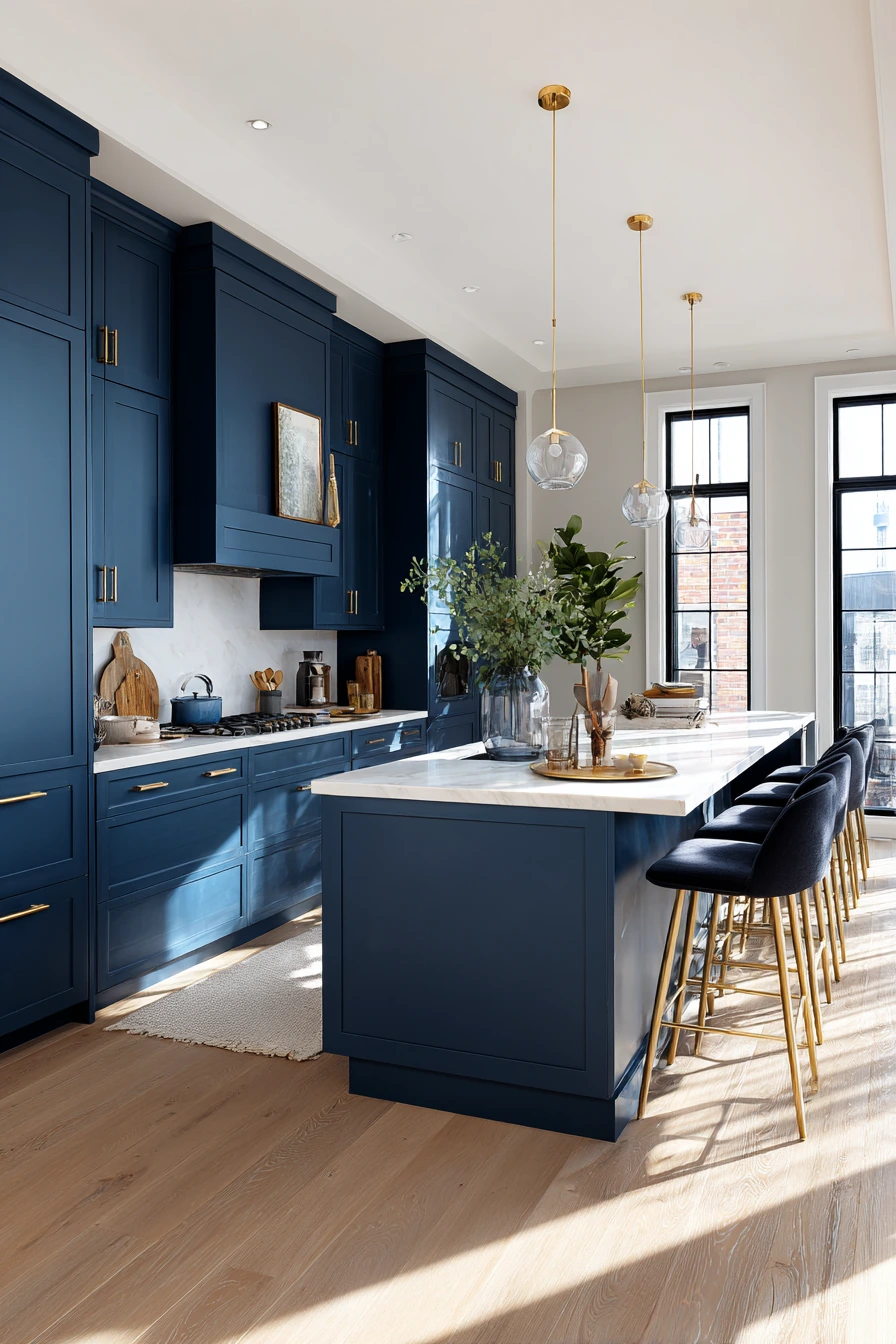
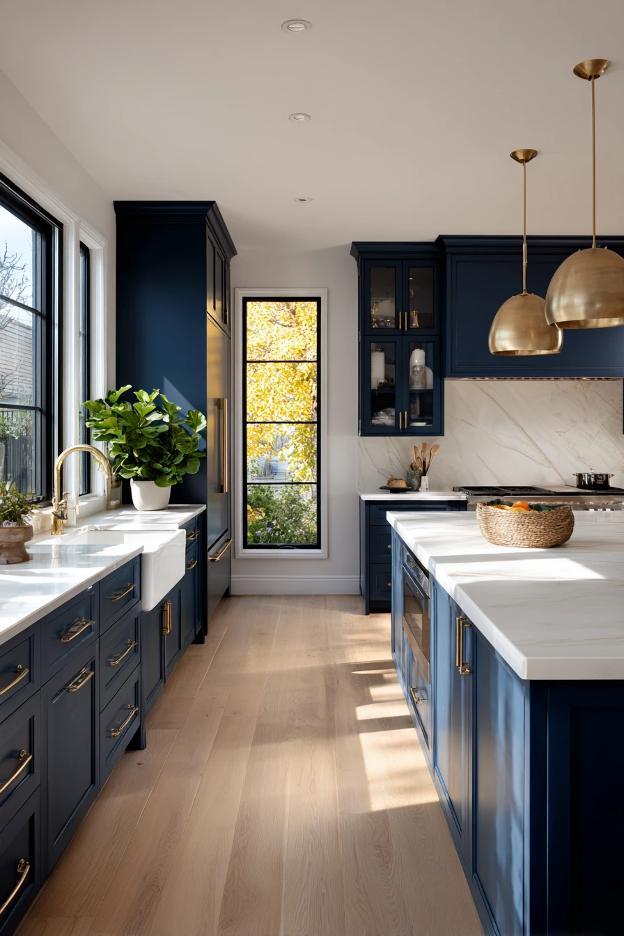
Deep navy blue cabinets are bold, but they can still feel calm when the rest of the room stays light. Pairing a matte navy finish with a white quartz countertop keeps the space crisp and clean. Light oak flooring adds warmth so the navy does not look too heavy.
Brass hardware is a natural match because it adds a soft glow against dark doors. Keep the rest simple: a few indoor plants, a plain bowl on the island, and clear counters. With wide windows and natural sunlight, navy cabinets become the main focus without making the room feel small.
To style this look, repeat the warm metals in a few spots, like pendant lights and a faucet. Choose a white or off-white wall color so the cabinet color stands out. If you want more texture, add a light runner rug and wood cutting boards leaning against the backsplash.
- Use a white quartz or bright marble look to keep contrast strong.
- Choose brass knobs or pulls with a simple shape.
- Add light oak stools or chairs to tie into the flooring.
- Keep decor minimal so the navy reads clean and modern.
- Bring in greenery to soften dark cabinetry.
Pro Design Tip: Use the same navy color on the island and perimeter cabinets for a high-end look, then add interest with mixed textures like matte doors and a slightly polished countertop.
Budget Considerations: Stock cabinets can be painted navy for less than replacing them; spend more on good primer and a durable cabinet enamel so the finish holds up.
2. Two-Tone Gray Cabinets (Dove Gray + Charcoal)
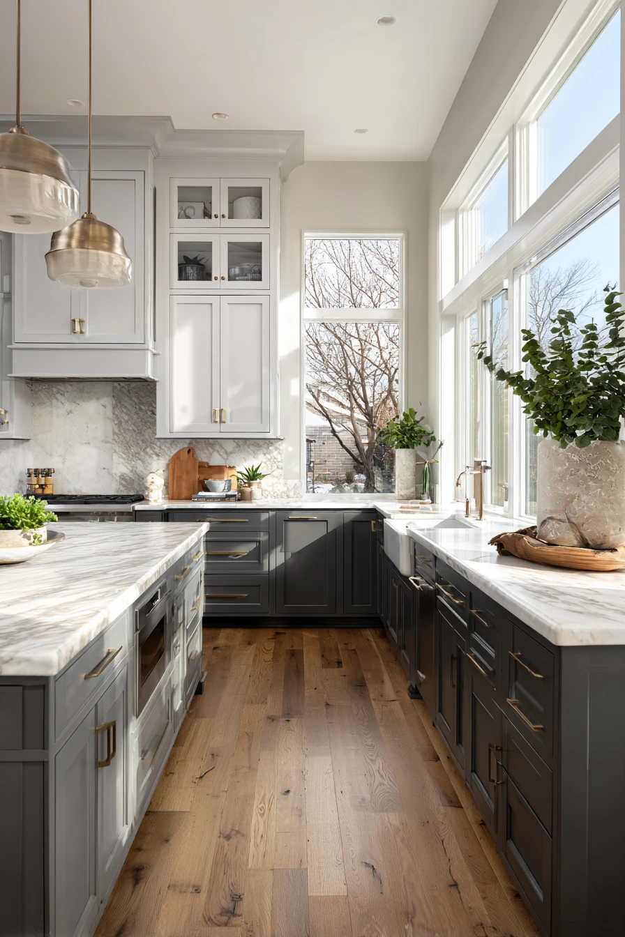
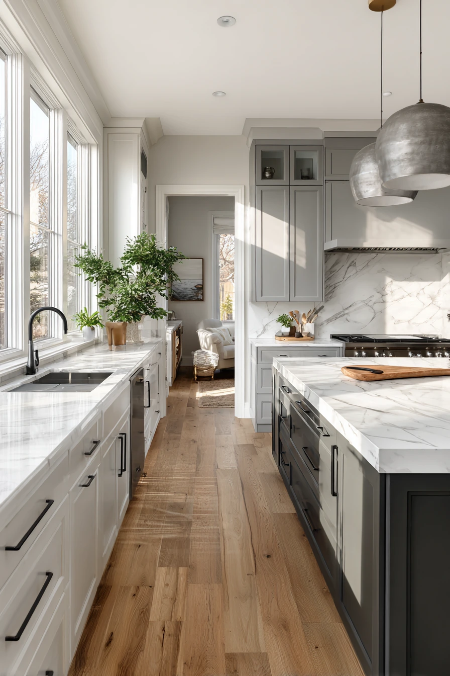
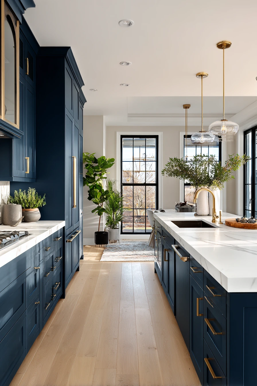
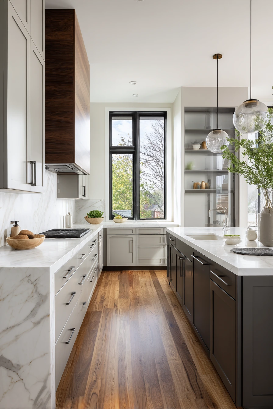
Two-tone kitchen cabinets are a smart choice if you want contrast without using a bright color. Soft dove gray uppers keep the kitchen open and bright, while rich charcoal lowers ground the space. With white marble countertops and warm wooden flooring, the whole room feels modern and balanced.
This combo works well in kitchens with large horizontal windows because sunlight helps the grays look layered instead of flat. Keep accessories minimal and repeat brushed metal finishes in pendant lights and hardware. A few small plants on the counter add life and stop the palette from feeling cold.
To style it, treat the charcoal as your anchor color. Use darker tones on stools, a rug pattern with charcoal, or black picture frames in nearby spaces. For the dove gray, bring in soft whites and light wood so the upper cabinets blend smoothly into the walls.
- Pick a marble or marble-look countertop with subtle gray veining.
- Use brushed nickel or brushed stainless hardware for a clean look.
- Choose warm wood floors to keep the grays from feeling icy.
- Keep backsplash simple, like white subway tile or slab stone.
- Add one warm accent, like oak shelves or a wood tray.
Pro Design Tip: Match the charcoal to another fixed finish (like dark window trim or a black faucet) so the contrast looks planned, not random.
Budget Considerations: If new two-tone cabinets are out of reach, paint only the lower cabinets charcoal and leave uppers white or light gray for a similar effect with less labor.
3. Mint Green Lower Cabinets With White Uppers
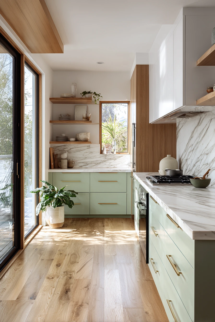

Pale mint green lower cabinets are an easy way to add color without taking over the kitchen. The look feels light and fresh, especially with crisp white upper cabinets. Light oak flooring and marble countertops keep the whole space soft and airy, which fits a Scandinavian-inspired style.
Mint works best when your kitchen gets plenty of natural light from large windows. It reflects light and looks clean, not loud. Keep open shelving minimal with a few ceramics in white, cream, or light gray. Add indoor plants for a natural touch that matches the gentle green tone.
To style this palette, use simple shapes and calm textures. Choose light wood stools, linen tea towels, and clear glass jars. If you want a little contrast, add black accents in small amounts, like a slim pendant light or a thin frame around artwork.
- Use white uppers to keep the top half of the room bright.
- Choose marble or quartz counters in white with quiet veining.
- Keep shelves tidy with matching ceramic dishes.
- Add warm wood pieces like cutting boards for balance.
- Use matte finishes for a calm, modern feel.
Pro Design Tip: Sample mint paint next to your countertop and floor in morning and evening light, since green tones can shift and look more blue or more yellow.
Budget Considerations: Painting only the lower cabinets mint saves money and reduces risk; if you change your mind later, repainting lowers is faster than repainting the whole kitchen.


4. Forest Green Cabinets With Brass Hardware


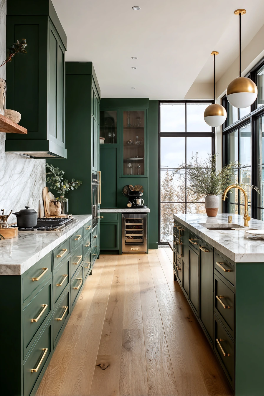
Deep forest green cabinets bring a rich, luxury feel while still looking natural. A matte finish keeps the color smooth and modern, not shiny. With a white marble countertop and brass handles, the contrast looks classic and polished.
Light oak floors help this darker green feel warm and livable. Keep decorative objects simple so the cabinet color stays the star. Pendant lights with soft metallic reflections work well here because they echo the brass hardware and make the room feel more layered.
To style forest green, stay in a warm, earthy range. Use cream walls, natural wood stools, and a few clay or stone accessories. Add greenery, but keep it controlled, like one tall plant by a window or a small herb pot near the sink. If you want more edge, add a black faucet or black pendant cord details.
- Pair forest green with white marble or marble-look quartz.
- Choose brass pulls with a simple, modern profile.
- Use light oak flooring or warm wood tones to soften the depth.
- Keep backsplash light, like white tile or pale stone.
- Add warm neutrals in rugs and textiles to balance the dark cabinets.
Pro Design Tip: Use under-cabinet lighting to brighten countertops and prevent deep green cabinets from casting shadows in work zones.
Budget Considerations: Brass hardware adds cost fast; mix finishes by using brass on main doors and a less expensive matching tone on interior drawers.

5. Soft Beige Cabinets for a Warm Neutral Kitchen


Soft beige kitchen cabinets are a safe choice that still looks current, especially in a matte finish. Beige reads warmer than white, so it feels welcoming without looking yellow. With white marble countertops and light oak flooring, the whole kitchen stays bright and open.
This palette is great for open shelving because the neutral backdrop makes ceramics and glassware look tidy. Use a few potted plants for color and life. Subtle metallic accents, like a brushed metal faucet or simple pendant lights, add a clean, modern touch without making the space feel busy.
To style beige cabinets, focus on texture. Mix smooth stone with warm wood and soft fabrics. Add a light runner rug, woven baskets, and a wood tray for everyday items. If you want a sharper look, add black accents in small doses, like a frame, a stool leg, or a thin cabinet pull.
- Choose a beige that leans warm, not pink or gray.
- Use white marble or quartz to keep counters bright.
- Style open shelves with simple ceramics in white and cream.
- Add wood tones to keep the neutral palette from feeling flat.
- Use a few metal details for a modern finish.
Pro Design Tip: Match beige cabinets with a backsplash that has gentle variation, like zellige-style tile or lightly veined stone, so the room has depth.
Budget Considerations: Beige works well with many existing finishes, so you may not need to replace floors or counters; a paint update and new hardware can be enough.


6. Charcoal Gray Cabinets With White Quartz Countertops

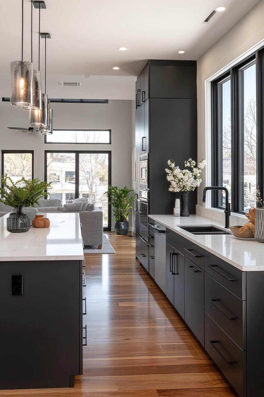
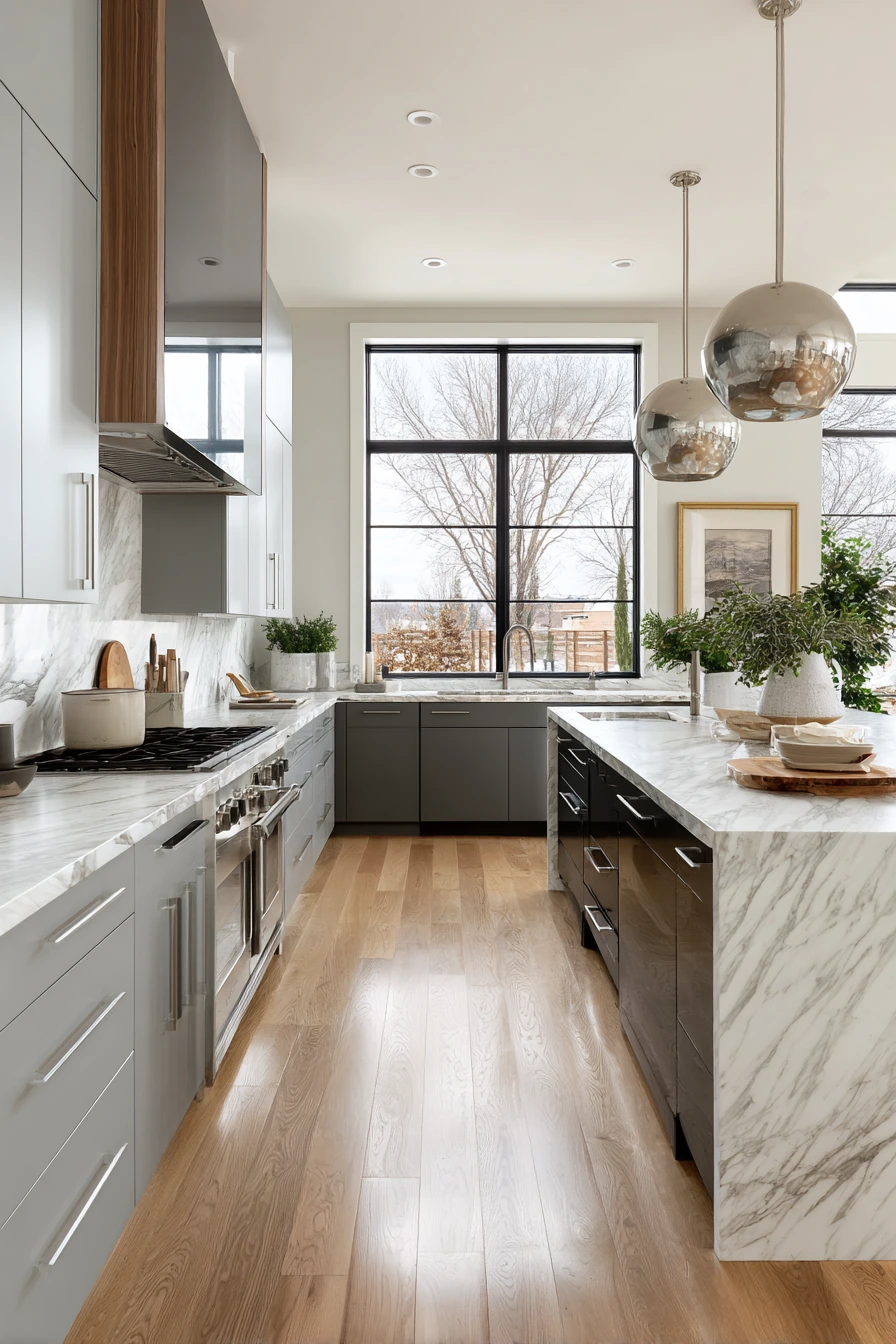
Deep charcoal gray cabinets create a sleek, modern look, especially with integrated handles. The clean lines feel simple and high-end, and the dark color makes a strong base for a bright white quartz countertop. Polished hardwood floors add shine and warmth so the room does not feel too dark.
This style looks best when the walls and backsplash stay light. Large windows and natural sunlight help show the cabinet texture and keep the space feeling open. Add subtle indoor plants and keep decorative items minimal so the kitchen stays sharp and functional.
To style charcoal cabinets, choose a tight color plan. Use whites, warm woods, and one metal finish like brushed stainless or matte black. If you want more interest, add a textured backsplash in white, like stacked tile or a small-scale pattern. Keep countertop items in matching containers so the look stays tidy.
- Pick bright white quartz for strong contrast and easy cleaning.
- Use simple pendant lighting with brushed metal finishes.
- Keep walls light to prevent the room from feeling closed in.
- Add warm wood accents like stools or shelves.
- Use consistent storage containers on counters for a clean line.
Pro Design Tip: Use two lighting layers, pendants plus under-cabinet lights, so the dark cabinet faces look intentional and the work areas stay bright.
Budget Considerations: Integrated-handle doors often cost more; you can get a similar look with low-profile edge pulls or modern bar pulls on standard cabinet fronts.


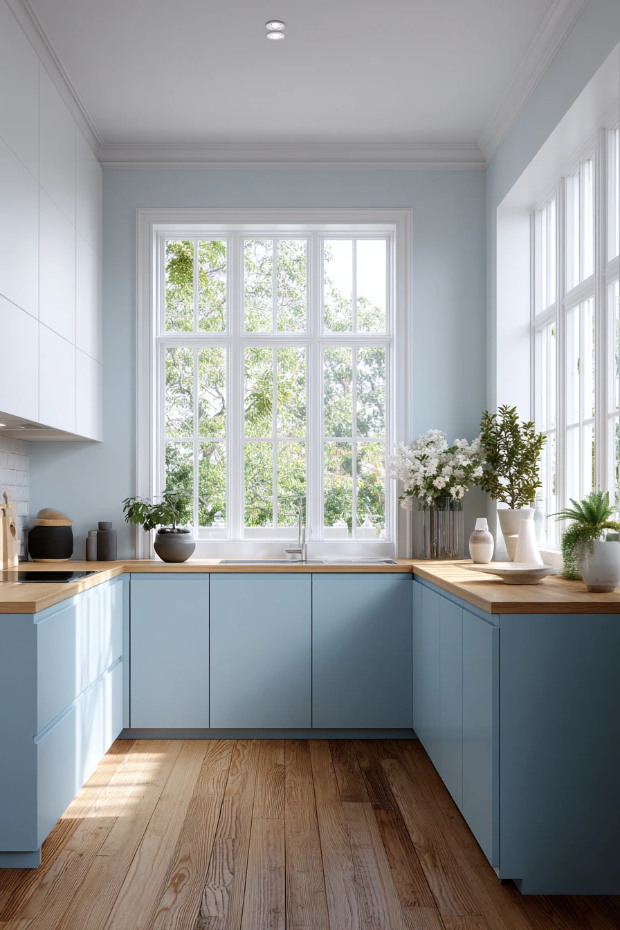
7. Powder Blue Cabinets in a Scandinavian-Style Kitchen


Powder blue cabinets add color in a soft, easy way. In a Scandinavian-style kitchen, the blue feels calm and clean, especially when paired with matte white upper cabinets. A light wood countertop adds warmth and keeps the space from feeling too cool.
Polished oak flooring and wide windows help this palette feel fresh and bright. Keep the decor simple with a few ceramic pieces and indoor plants. The goal is a light, airy room with clean lines, not a lot of patterns or extra items on the counter.
To style powder blue, choose whites that are not too creamy, and keep metals simple. A brushed stainless faucet or a matte black fixture both work well. Add natural textures, like a woven basket for towels or a wood tray for oils. If you want more contrast, use black in small details only.
- Pair powder blue with white uppers for a bright top half.
- Use a light wood countertop to warm up the blue tone.
- Choose simple ceramic accessories in white or light gray.
- Add plants to bring in natural green and soften the palette.
- Keep patterns minimal for a true Scandinavian feel.
Pro Design Tip: Use the same powder blue on a pantry door or a small built-in area to repeat the color and make it look planned.
Budget Considerations: If replacing countertops is not possible, powder blue still works with many laminates; focus spending on good lighting and fresh hardware for the biggest change.

8. Matte Olive Green Cabinets for an Open-Concept Kitchen

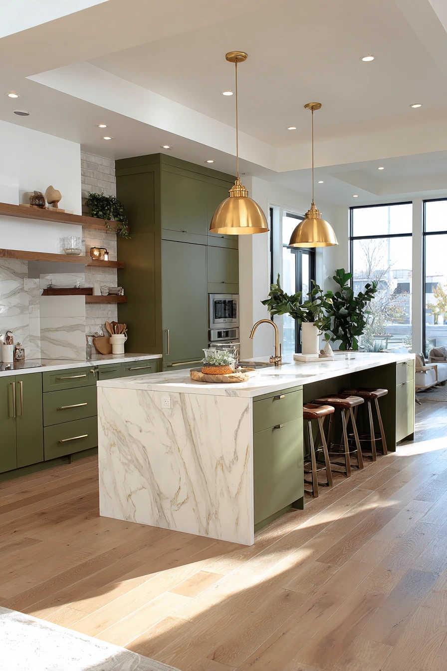
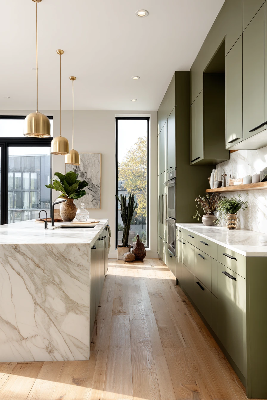
Matte olive green cabinets are bold, but they feel grounded and natural. In an open-concept layout, olive can act like a neutral because it pairs well with wood, white, and stone. Light marble countertops keep the space bright, while warm wooden floors add comfort.
Minimal white upper cabinets create balance so the green does not take over. Natural sunlight from expansive windows helps the olive look soft and rich, not muddy. Pendant lights with brushed gold finishes add warmth and tie in nicely with the green cabinet color.
To style olive cabinets, keep the supporting pieces simple and warm. Use cream walls, light wood stools, and ceramics in white or sand tones. Add a few indoor plants, but do not overdo it since green-on-green can look busy. If you want more contrast, add matte black in a faucet or thin hardware.
- Choose a light marble or quartz top to brighten olive cabinetry.
- Use brushed gold or brass lighting for a warm, modern look.
- Keep uppers white or very light to reduce visual weight.
- Add wood tones through floors, stools, and small accessories.
- Limit countertop decor to a few calm, neutral items.
Pro Design Tip: Olive looks best with warm whites; test paint samples next to your backsplash tile so the green does not shift too gray.
Budget Considerations: If you want the olive look on a budget, paint the island olive and keep perimeter cabinets white, so you use less paint and less labor.

9. Black and White Two-Tone Cabinets With a Marble Waterfall Countertop
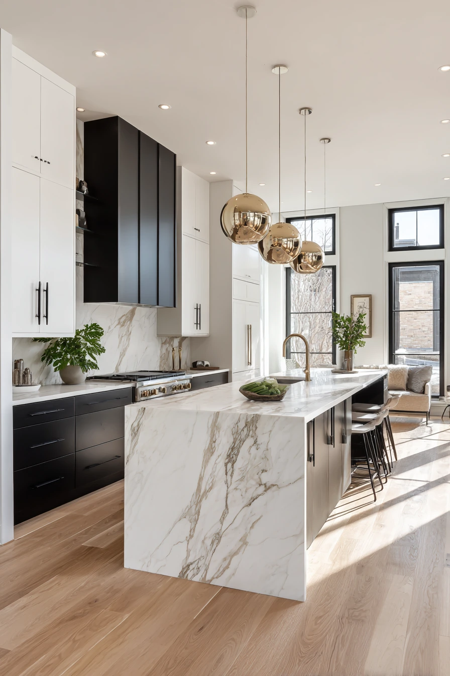
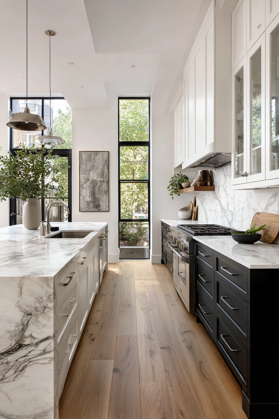
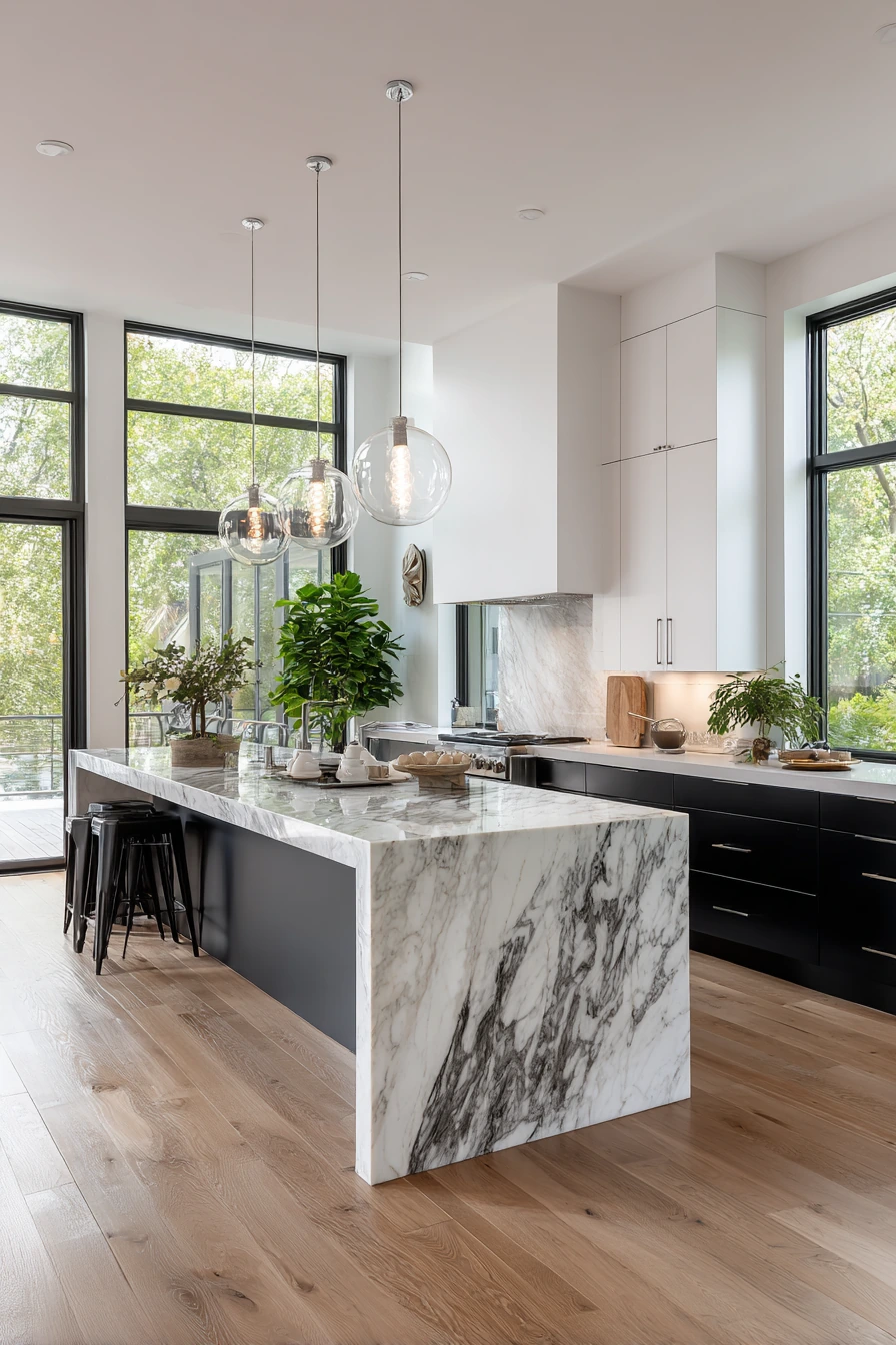
Black and white kitchen cabinets are a classic two-tone choice that still feels modern. White upper cabinets keep the room bright, while matte black lower cabinets add depth and drama. A marble waterfall countertop becomes a strong focal point and ties the tones together.
Wide windows and sunlight are important with black cabinets because light helps show the clean lines. Polished oak floors add warmth so the black does not feel harsh. Keep decor minimal and add a bit of greenery to soften the contrast.
To style this look, repeat black in a few places, like a faucet, bar stools, or window trim. Keep your backsplash simple, like white tile or a clean slab. Choose pendant lights with soft metallic reflections so the space has shine without feeling busy. Use matching storage containers to keep counters looking neat.
- Use white uppers to keep the kitchen from feeling dark.
- Choose matte black lowers for a modern, fingerprint-friendly look.
- Pair with warm oak floors or wood accents for balance.
- Keep backsplash and walls simple for a clean contrast.
- Add one metal finish, like brass or brushed nickel, and stick with it.
Pro Design Tip: Use a slightly warmer white for uppers if your marble has warm veining, so the white does not look too stark next to the stone.
Budget Considerations: Waterfall countertops can be expensive; a standard edge on the island plus one waterfall side can give a similar feel for less.

10. Pastel Peach Cabinets With White Uppers
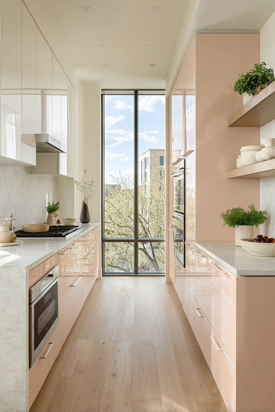

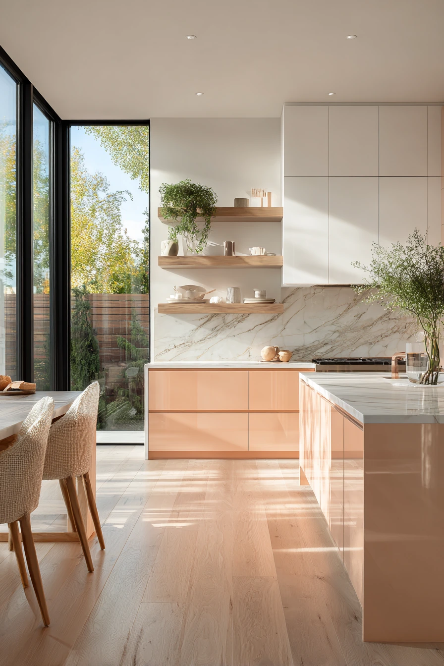
Soft pastel peach cabinets bring warmth and a gentle color boost. When combined with crisp white upper cabinets, peach feels modern and clean instead of sweet. Light oak floors and marble countertops keep the palette bright and help the peach look fresh in natural sunlight.
This color works well with minimalist open shelving. Use subtle ceramics in white, sand, or light gray, and add a small amount of greenery. Because peach is a warm tone, it pairs well with brass, brushed gold, or even a simple stainless finish if you want a cooler balance.
To style pastel peach, keep the rest of the room calm. Choose a simple backsplash, like white subway tile or a pale stone. Use light wood bar stools and linen towels. If you want a bit more contrast, add small black accents, like a thin pendant frame or a black faucet, but keep it limited so the space stays soft.
- Pair peach lowers with white uppers to keep the room bright.
- Choose light oak floors to match the warm undertone.
- Keep shelves simple with matching ceramics.
- Use warm metal finishes for hardware and lighting.
- Add neutral textiles to keep the look calm and modern.
Pro Design Tip: Pick a peach with a muted, dusty tone, not a bright orange, and test it next to your marble so the undertones do not clash.
Budget Considerations: Pastel shades show scuffs more than mid-tones; a higher-quality cabinet paint and a satin finish can reduce touch-ups over time.

The best kitchen cabinet color ideas are the ones that match your light, your counters, and the finishes you already have. Dark tones like navy, forest green, and charcoal look sharp with white quartz or marble, while softer shades like beige, mint, powder blue, and peach keep a room bright and relaxed.
If you want a simple update, start with paint and hardware, then adjust lighting and styling. Small choices like a warm metal finish, tidy open shelves, and the right wall color can make cabinets look more custom.
FAQ
What kitchen cabinet color is most timeless? White, warm beige, and soft gray are the most classic. Navy and forest green can also feel timeless when paired with simple countertops and hardware.
Do dark kitchen cabinets make a kitchen look smaller? They can if the room has low light. Balance dark cabinets with bright countertops, light walls, and layered lighting.
What hardware looks best with navy or green cabinets? Brass and brushed gold look warm and rich. Brushed nickel works if you want a cooler, cleaner look.
Are two-tone cabinets still in style? Yes. Two-tone designs like white uppers with charcoal or black lowers are popular because they add contrast without overwhelming the space.
How do I choose a cabinet color that matches my floor? Look at undertones. Light oak floors work well with most colors, but they look best with warm whites, warm metals, and muted paint shades.
Should I use matte or satin paint on cabinets? Matte hides glare but can mark more easily. Satin is easier to wipe down and is often a good middle option for busy kitchens.